Mobile email design
2. April 2013
E-mail marketing and sales: a cat-chase-dog scenario
2. May 2013
Padding, spacers and other tricks
The technical properties of browsers and email clients can greatly influence the way an email campaign is presented. To ensure an acceptable end result, the chief pitfalls associated with implementing a campaign in HTML should be well understood by everyone involved – from project managers and concept developers to copywriters, designers and programmers. We have compiled the most important issues below, and show you how to master the intricacies of HTML presentation.
What will the email look like when it reaches the target group?
There’s little point in discussing email campaign layouts unless you take into account from the outset how the MIME and HTML coding will be processed at the recipient end. The front-end systems that display the mails have a major impact on their look & feel – in other words, what the recipient actually sees. Here is a list of the main factors:
- 5 leading systems: Windows, Mac OS X, iOS, Android, Linux
- 5 leading browsers: Internet Explorer, Firefox, Safari, Chrome, Opera
- about 20 different email clients
- … and all of the above in many different versions and operating system/front-end combinations
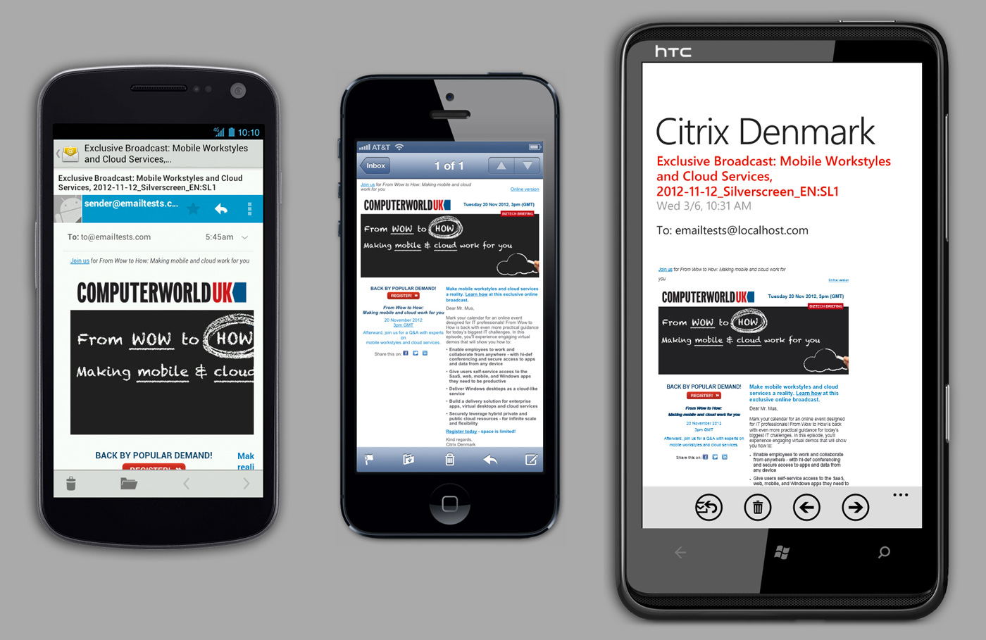
In light of their special features and constraints, it makes sense to analyse mobile clients separately when developing the concept (see our article, Mobile email design, for more details).
To ensure that your email campaign is presented correctly to your recipients, you need to give due consideration to the properties of the various devices, operating systems, web browsers and email clients as soon as you start planning your campaign. Exactly what that means for the campaign’s design, and how you can minimize the impact of rendering differences, is explained below.
Using large images
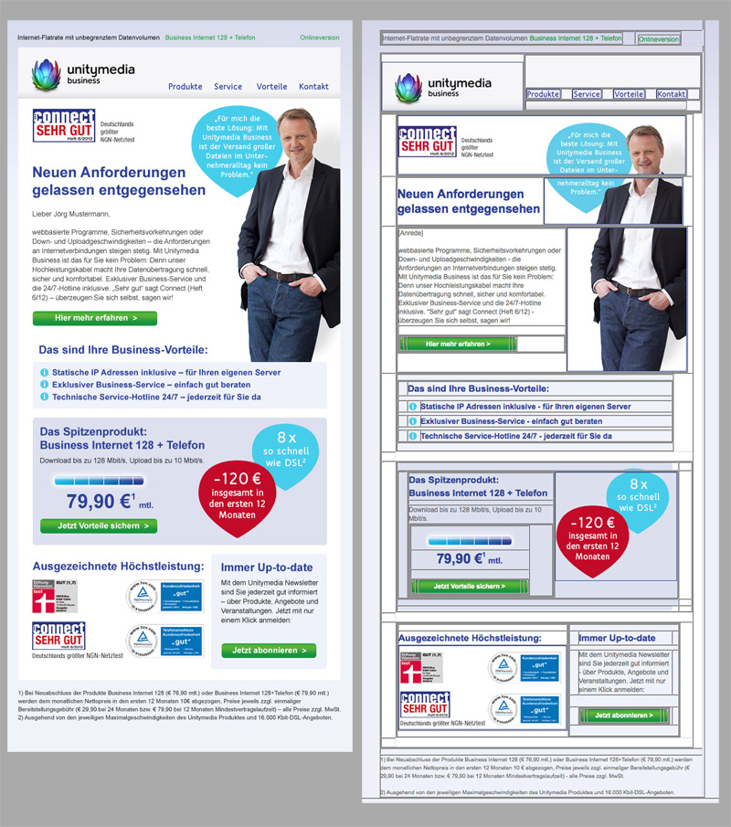
Marketing emails typically contain a lot of graphics. If you wish to incorporate large images, the structure of the email’s HTML code can lead to problems. Since many email clients still don’t fully support Cascading Style Sheets (CSS), email content is often arranged by means of HTML table structures. This can guarantee that the layout of an email is displayed correctly in all email clients. But it also means that large images must be broken up in order to fit them into an HTML table structure.
Breaking up graphics across multiple cells of a table has its pitfalls: if a neighbouring cell differs from its planned size, for instance if the text in an email client is displayed larger than expected (see Font rendering), this can lead to “cracked” graphics.
To prevent this problem, you need to include white space below the copy: the cell containing the copy needs to be a little larger than the copy actually needs. As a result, the copy can be displayed by clients in slightly different ways without interfering with the graphics.
Transitions between different areas
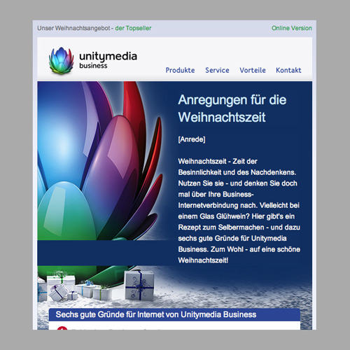
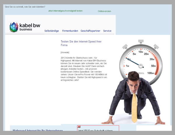
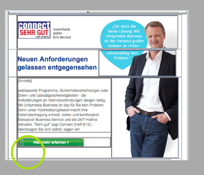
Emails with overlapping text and graphics areas, as in the example below, are a further potential source of errors:
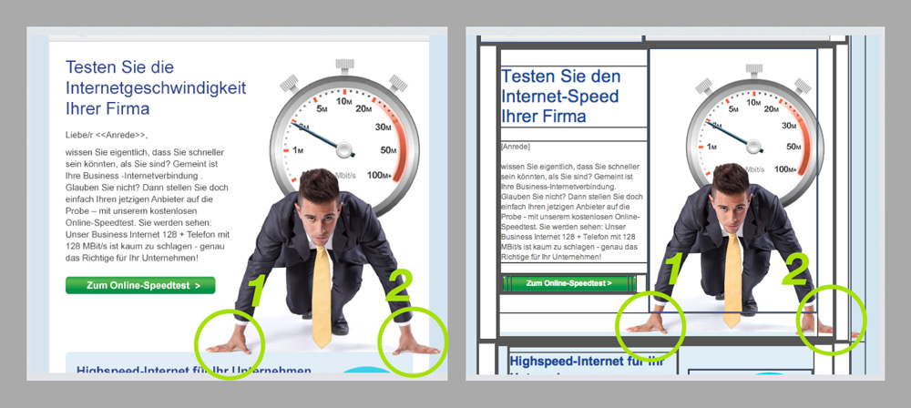 The image must be split up into several pieces, particularly at the outer edge (2), because it is spread across many cells in the HTML table structure.
Here, too, graphics must be broken into several sections. This makes the HTML code far more complex. As older email clients, in particular, have trouble interpreting deeply nested HTML structures, rendering errors are inevitable.
For this reason, we recommend arranging email content in clearly defined content areas. To avoid having to restructure an email later, this should be taken into account at the design and concept development stage.
Font rendering
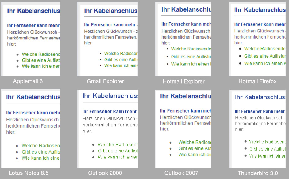
With Arial & co, you don’t always get what you expect – as you can see in the graphic below, which shows how different browsers and clients render fonts.
The fact that different systems render fonts in different ways means the spacing is not consistent, either. This phenomenon cannot be completely eliminated, but it is possible to minimize the differences.
Try to avoid long, unbroken stretches of copy. Text blocks that are short and to the point are not only easier to read; they also have a positive side-effect with respect to the layout: total text lengths vary less from client to client.
Where necessary, defined amounts of padding can be incorporated. “Transparent” spacers, also known as spacer images, should be employed. These are invisible graphics that match the corresponding background colour. Integrating spacers prevents text from crowding other content (such as graphics).
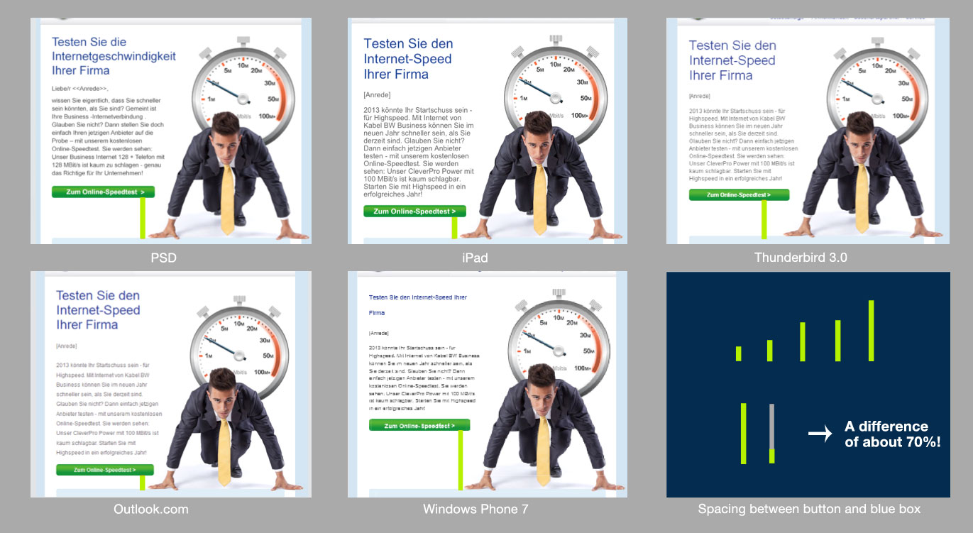
In addition, mobile clients require careful consideration. By default, these clients increase font sizes to 13 pixels to make content easy to read on a small device. So you need to allow for more space in the layout of your email campaign – unless you opt for a mobile version from the outset. For more on this topic, please read our article, Mobile email design.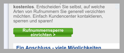
Automatic font resizing on mobile clients (here: iPad) can ruin your layouts
When designing your emails, you should always allow for sufficient space beside and below text blocks. For example, we would recommend designing one layout version with dense line spacing and another with generous line spacing to simulate the appearance of the email on different clients.
In a nutshell
To conclude, our recommendations are as follows:
- Start planning your project early – involving all participants and taking all relevant technical parameters into account
- Create a clearly defined layout – with minimal overlap between text and graphics areas. This will ensure your campaign’s HTML code has a well defined structure, and you won’t need to break up the graphics so often
- Incorporate spacers in the code at critical places – this will prevent one content area from crowding another
- Allow extra space for larger text sizes – avoid long, unbroken stretches of text and create versions that let you test the effect of different text renderings
Are your emails ready for business?
Send us a test email from your campaign, and we’ll provide you, free of charge, with an analysis showing exactly how your campaign will look on different devices, email clients and browsers.
Photo: schiffner / photocase.com


