E-mail marketing and sales: a cat-chase-dog scenario
2. May 2013
Campaign2Event – Event Communication
27. June 2013
How mobile do emails need to be? As mobile as the people reading them!
Emails have been mobile a good while now. In a recent survey by Return Path 62 percent of all respondents in the UK said they read their mail on mobile devices every day – and 71 percent do so on a desktop PC. This adds up to more than 100 percent, because many of them read their mail both on a smartphone and on a PC. So to maximise their impact, marketing mails have to be just as flexible as their recipients: According to another Return Path survey, 63 percent of all respondents in the USA and 41 percent in Europe said they normally close, or even delete, emails not optimised for a mobile device. What a waste of potential conversions!
How is responsive design utilised in practice?
The solution to maximising email flexibility is responsive design. CSS3 Media Queries make it possible to design emails that automatically adapt their appearance to the reader’s device (for details, read Part 1 in this series. But because of the complexities of email source code, responsive design can be time-consuming and expensive. In light of limited budgets and the need to get campaigns out fast, putting responsive design into practice can seem quite a challenge. The solution: a combination of template-based email campaigns and a platform that takes care of many of the technical details behind the scenes.
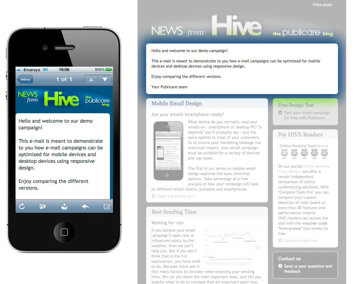
Take a look at this example.
As a service partner of emarsys eMarketing Systems, Publicare works with the eMarketing suite and its integrated Mobile Sense technology. Allow us to show you how this distribution platform helps us tailor our newsletter to mobile devices.
Automatic adaptations
In the real world, responsive design can only be applied across all campaigns if the additional effort needed to produce a campaign is not excessive. A convenient solution is to employ a template that contains all of the most complex code. This means that when you create your template-based campaign, the mobile version is generated more or less automatically. When you use Mobile Sense technology, every responsive template offers the following advantages “off the shelf”:
1. Text: optimised readability
Fonts are resized to optimise readability on mobile devices
Font sizes that are easy to read on a desktop PC can be hard to decipher on small smartphone displays. Are zooming and scrolling the only answer? No. With an appropriate responsive template, fonts are automatically increased to a convenient size for mobile devices.
2. CTAs: maximum user-friendliness
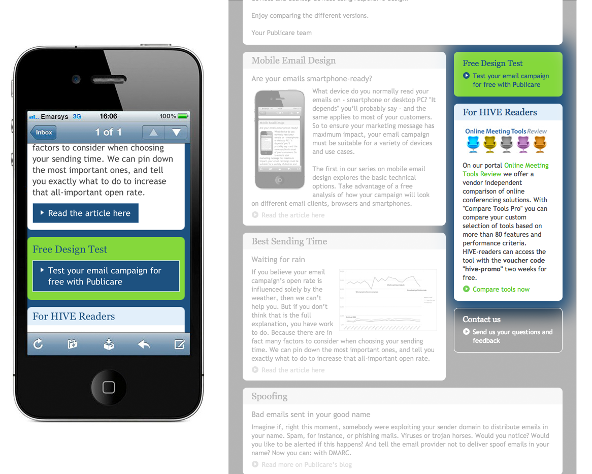
Maximum user-friendliness thanks to buttons and sufficient spacing for mobile devices
Maximum user-friendliness thanks to buttons and sufficient spacing for mobile devices
Text links that are simply to use via mouse can pose problems if a smartphone user has to click on them using a thumb. That’s why our demo newsletter doesn’t show text links to mobile readers, replacing them with convenient buttons at the end of paragraphs. The spacing is generous enough to allow the user to click on one of a series of buttons placed one below the other. And since most people hold their smartphone in their right hand and click and scroll with their right thumb, the layout has been optimised accordingly: with left-aligned copy and the CTAs either centrally or left-aligned, too.
3. Design: optimised presentation
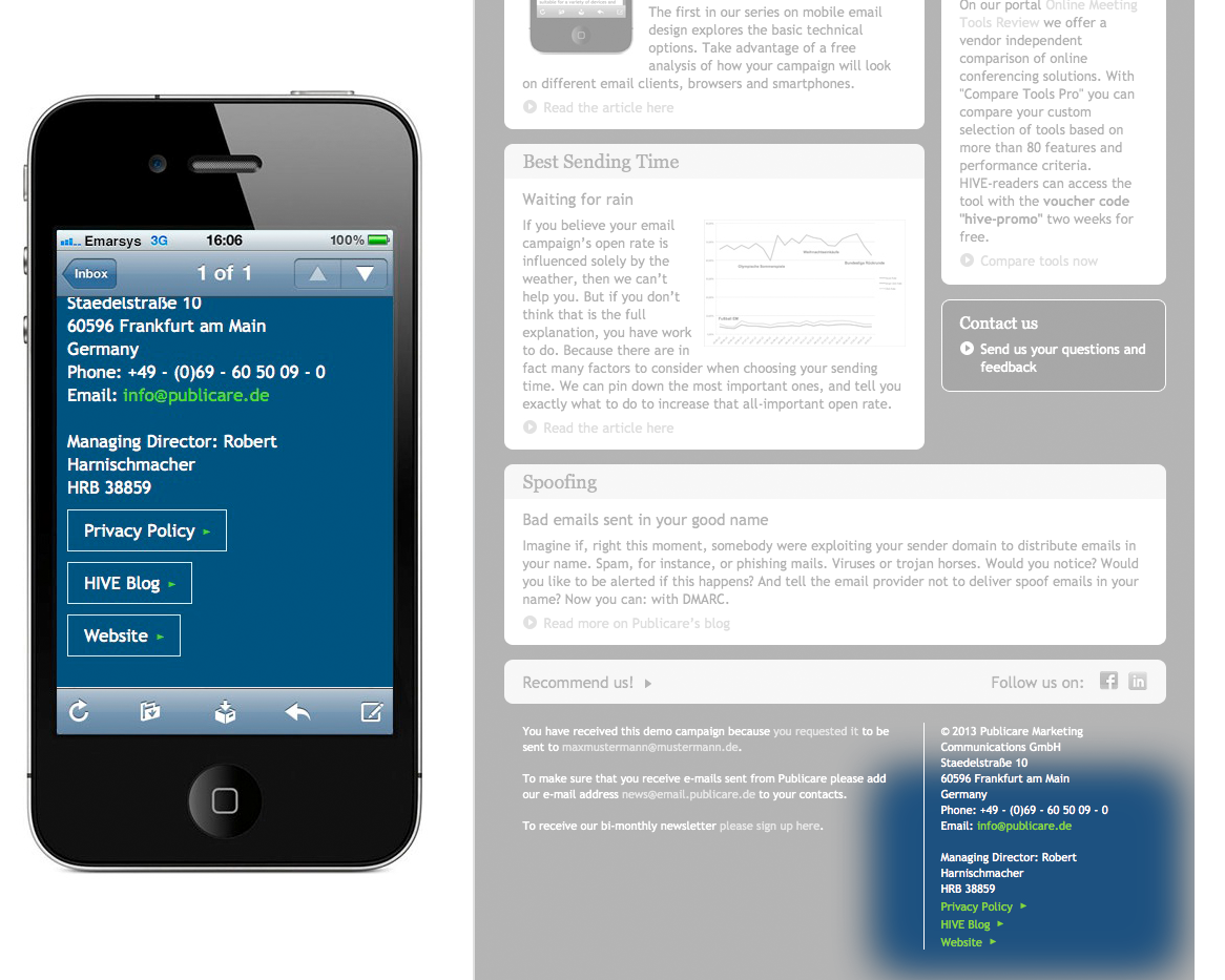
Optimised presentation through a single-column layout for mobile devices
Wide layouts comprising two or even three columns are not a problem for the desktop version of your emails: they are often the best choice for the broad format of PC monitors. But when it comes to smartphone displays, it’s another matter: even when viewed in landscape format, these are still quite narrow. For this reason, a good responsive template must ensure that the horizontal desktop design is converted to a vertical layout for mobile devices, with a single, easy-to-read column. With Mobile Sense, awkward horizontal navigation bars can either be hidden, shown with fewer elements, or converted to vertical bars.
How responsive design is displayed on iPhones and Android devices
All iPhone native email clients support responsive code. With Android devices, the way emails are displayed depends on the hardware, the operating system version and the email app used. However, the number of new devices that support CSS3 Media Queries is growing all the time.
Manual adaptations
The “automatic” mobile template adaptations described above are ideal for tailoring emails to the technical and ergonomic features of mobile devices. But you also need to consider the type of situation in which mobile users read their mail. Emails viewed on handheld devices are often opened on the fly or while the user is doing something else. So the reader’s attention span will be even shorter than that of a PC user. Which means the content of a mobile email has to be short and sweet. Otherwise, the message simply won’t hit its mark. In a nutshell: when it comes to mobile emails, less is more. To this end, the Mobil Sense template offers a number of easy-to-use features that let you pare down the content of your mails and make them more mobile-friendly.
Hiding content
To cut your campaign content down to the bare bones quickly and radically, the Mobile Sense template lets you hide whole sections from mobile readers. In our demo newsletter, we made an entire article disappear.
Hiding graphics
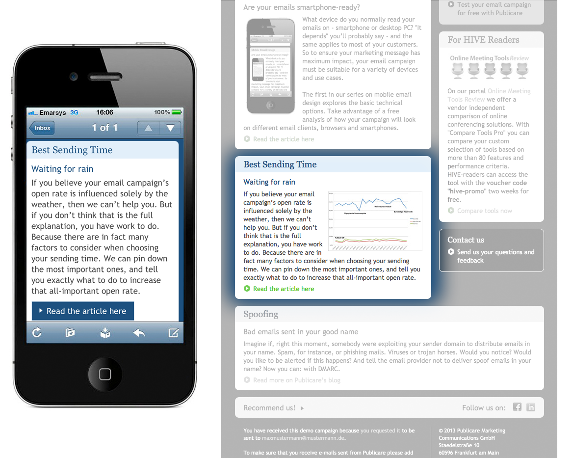
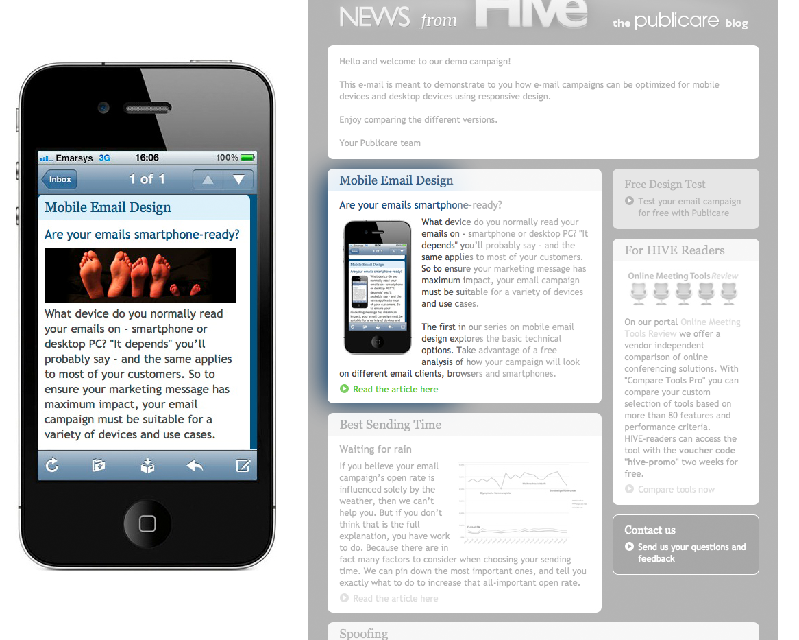
Hiding graphics for mobile users
Desktop versions of emails can’t do without graphics – they are truly eye-catching and can elicit an emotional response. But mobile users often view large images as an annoying waste of space that requires a lot of scrolling. If you don’t wish to hide an entire section of text containing graphics, you can hide just the graphics from mobile users.
Replacing graphics
Alternative graphics for mobile users
What if you want your mobile readers to see a particular graphic, but it takes up too much space in the mobile email? One solution is to select a separate, “mobile” graphic for your mobile readership. This lets you show small banner graphics in a larger font, for example, or display a completely different image on mobile devices.
Now your mail’s ready to go mobile
Responsive design can be simple and straightforward to implement – provided you have the right tools. A platform that offers high-quality responsive templates enables you to tailor your mails to the needs of mobile users quickly and easily.
See for yourself
If you’d like to receive regular updates from Hive and more information about email marketing, register here for our blog digest.


